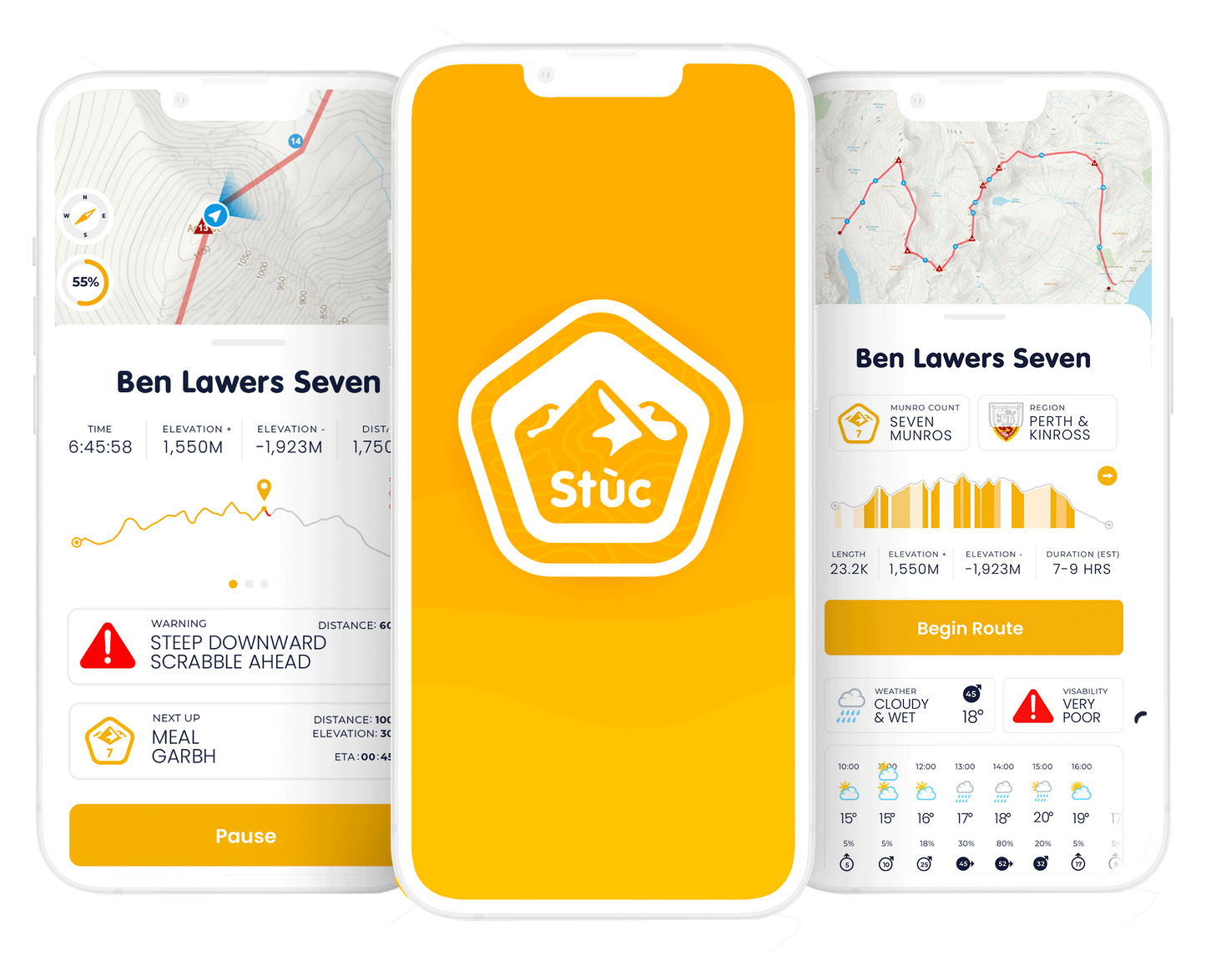
Stùc iOS App Progress Screen
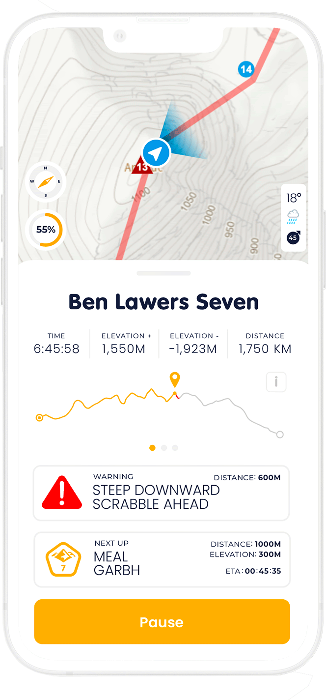
Stùc iOS App Progress Screen
A long term project that myself and a developer are embarking on, is the construction of a native iOS app to help plan, track and keep tally of the user’s journey towards successfully bagging all 282 of the Scottish Munros.
With the aim of expanding the brand further down the line, the core product will provide routes, goals, weather forecasts, offline maps (and links to the relevant OS printed maps) along with baked in safety features such as integrated ThreeWords GPS data and emergency service numbers.
The problem
Having embarked on a soul crushing journey to bag seven munros in one outing, several functions that needed to be included in the app became essential to the live journey screen. Clear navigational aids such as warnings when approaching a dangerous area, or a progression bar to show how far you’ve come to mention a few. In addition, due to the nature of the environment the app would be getting used in – it was essential that the layout be clear, concise and above all else – easy to use, avoiding the complexity and irritations caused by similar offerings from competitor apps
The Approach
First and foremost, navigation was crucial, so selecting a map that is clear yet detailed was an utmost requirement. The topographic lines that are standard on the legendary Ordnance Survey maps add an element of understanding to the terrain that surpasses even a satellite image – letting you see at a glance where a sudden drop is in relation to you. The added benefit of the muted colours on the map allows the user an at a glance understanding of where they are, what’s coming up, and the direction they’re heading in.
Once the basics of the compass and a journey timer had been included the next fundamentals was the data of the expedition – keeping tally of the distance covered or still to come, the elevation gained along with the total time. Tiering the importance of the information on screen meant this needed to be visible – yet not domineering. Similarly the visual chart of the trek couldn’t be overpowering, so by default it shows a yellow line for the completed route, and red line in front of the marker that corresponds to any warnings of upcoming hazards. A more detail chart of the trek is available by swiping the carousel to the right, showing a view that grades how difficult the route is at which point.
The final tier of information on the screen is the list of munros on the route with ETAs and distance to go and live data running in the background. All of these are clickable to a detailed overview of the munro with stats on height and historical info.
The Solution
I think this is a good starting point for a high fidelity concept. It clearly delivers on delivering a complex set of data in an organised and methodical way that is easy to see while halfway or indeed all the way up a mountain. When building this out into a prototype i’d like to work in extra elements to the design – such as an emergency sos buttons, or investigate how overlays could provide more additional information for the user in the midst of a long day of hiking


