Oor Wullie Site Design
Oor Wullie Site Design
With the success of the Oor Wullie bucket trail, there was a keen desire to capitalise on the publicity and popularity around The Broons and Oor Wullie Brands. As part of my final months at DC Thomson I was heavily involved in designing merchandise for both of the Sunday Post’s famous strips.
One of my last projects was to revisit the online presence for them both, particularly Oor Wullie, to replace the now dated bucket trail site.
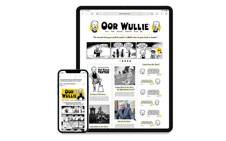
Aiming to keep the site clean and simple, I wanted to stay clear of previous iterations of the branding that had focussed heavily on traditional tropes of comics – bright colours, props from comic strips – in OW’s case buckets, jeemsie the moose, catapults etc, and finally the heavily stylised scrapbook feeling that had been adopted.
This said, the site designs would be predominantly remain black and white, as the strips appeared in the Sunday Post, using only the yellow from the Oor Wullie Tartan as an accent to lift the site and add highlights where necessary.
While there was some commercial cross sells further down the site, the key function of the site was to capitalise on the newly engaged visiting audience and as such, the space above the fold is reserved entirely for content – the previous week’s comic from the Sunday post in the carousel – interviews and articles about A’Body’s Wullie, with a social wall on the right, customised to deliver the latest tweets inside branded bubbles.
In tandem with the site – the concept also included a newsletter, featuring the same comic strip (keeping the final third as a reward for clicking through to the site) and a cross sell for branded merchandise further down the newsletter.
Sadly, this only ever became a concept – presumably down to the global mayhem of the following year – but as a swan song to my time at DC Thomson, I really enjoyed working with these iconic characters one last time – it was, as the boy says – The Very Dab!


